
01 Commercial work
Jolly Phonics
A full redesign of a phonics app used by millions of children, rebuilt around how kids actually process colour, shape and play.

With a master's degree in Applied Psychology and 2+ years of commercial experience designing real-world products across learning and everyday work, I bring a rare mix of empathy and precision to every project.
Most recently: a full redesign of a children’s phonics app with 9M+ downloads, and a B2B scanning app designed end to end, from first wireframes to developer handoff.
A full redesign of a phonics app used by millions of children, rebuilt around how kids actually process colour, shape and play.
Case study · 2024–2026 · Mobile
All four screens start on the original design and redraw into the redesign as they scroll into view.
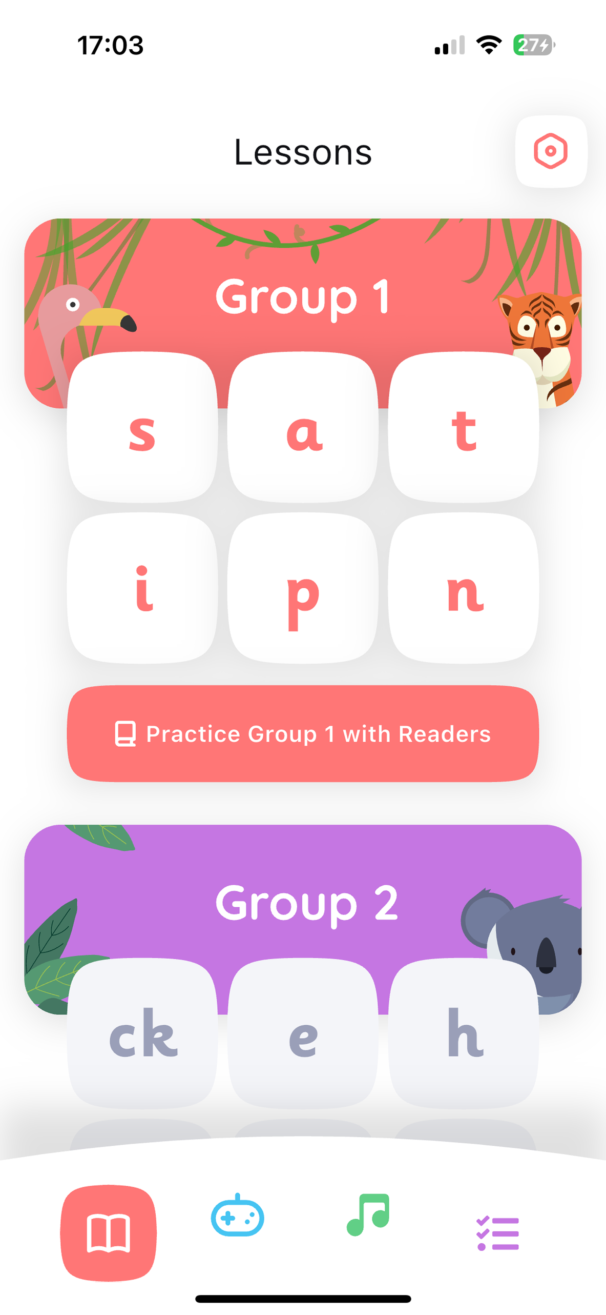
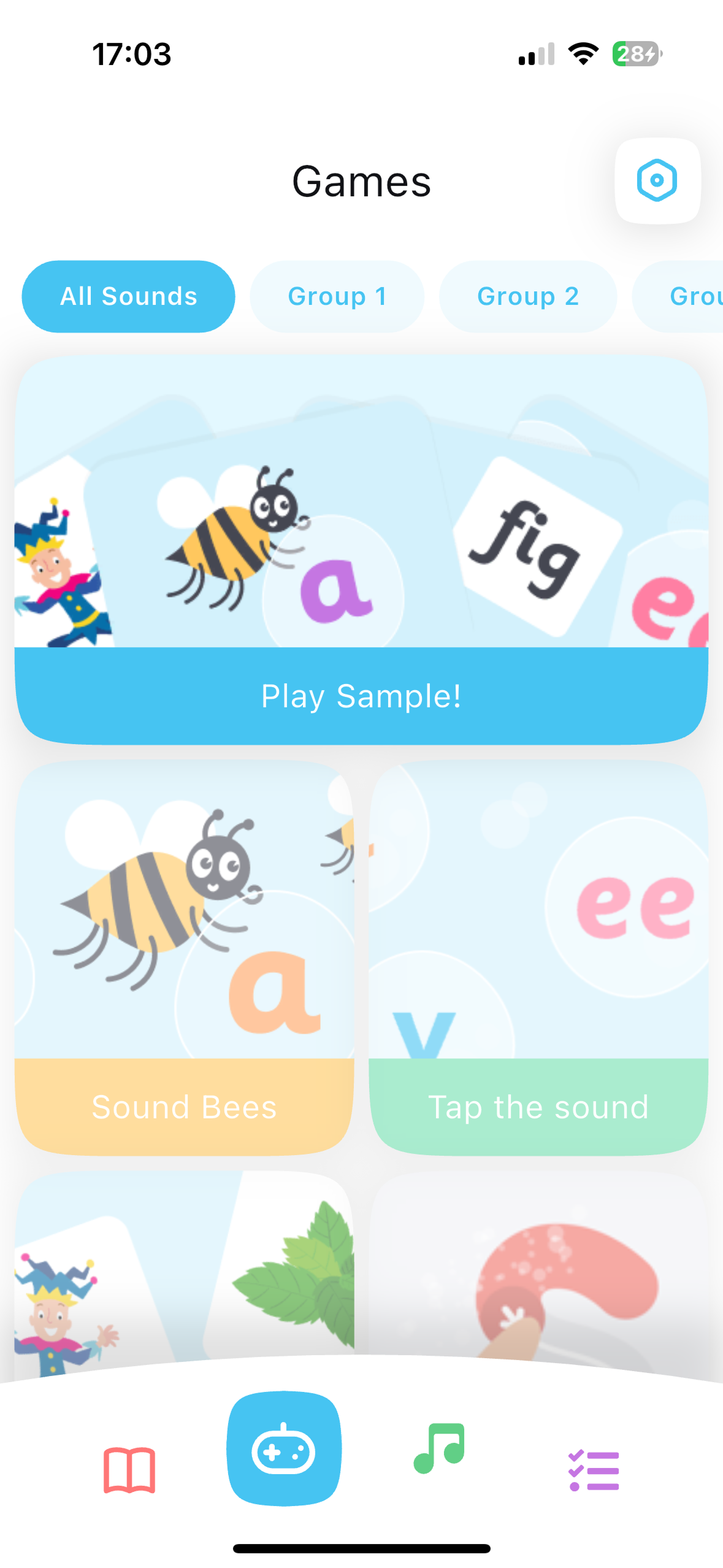
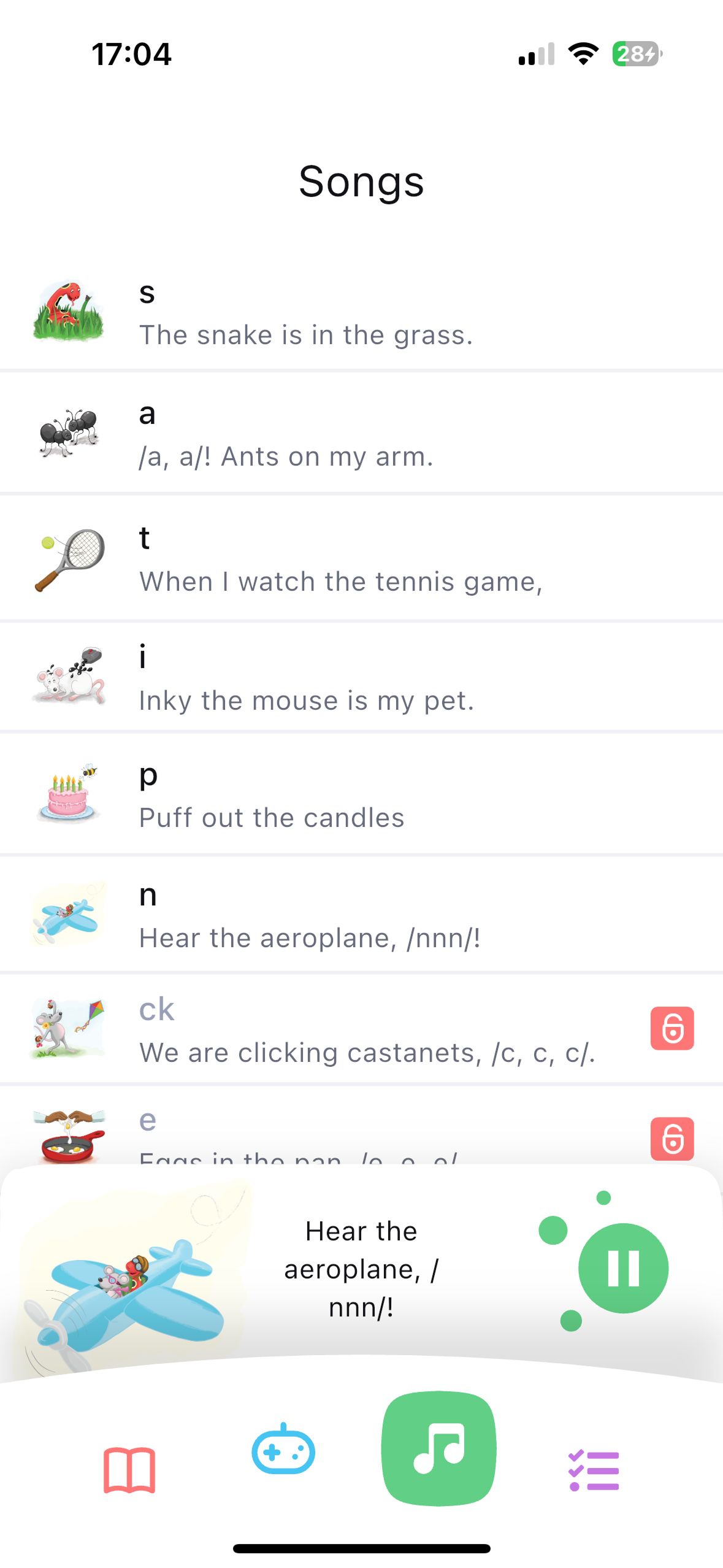
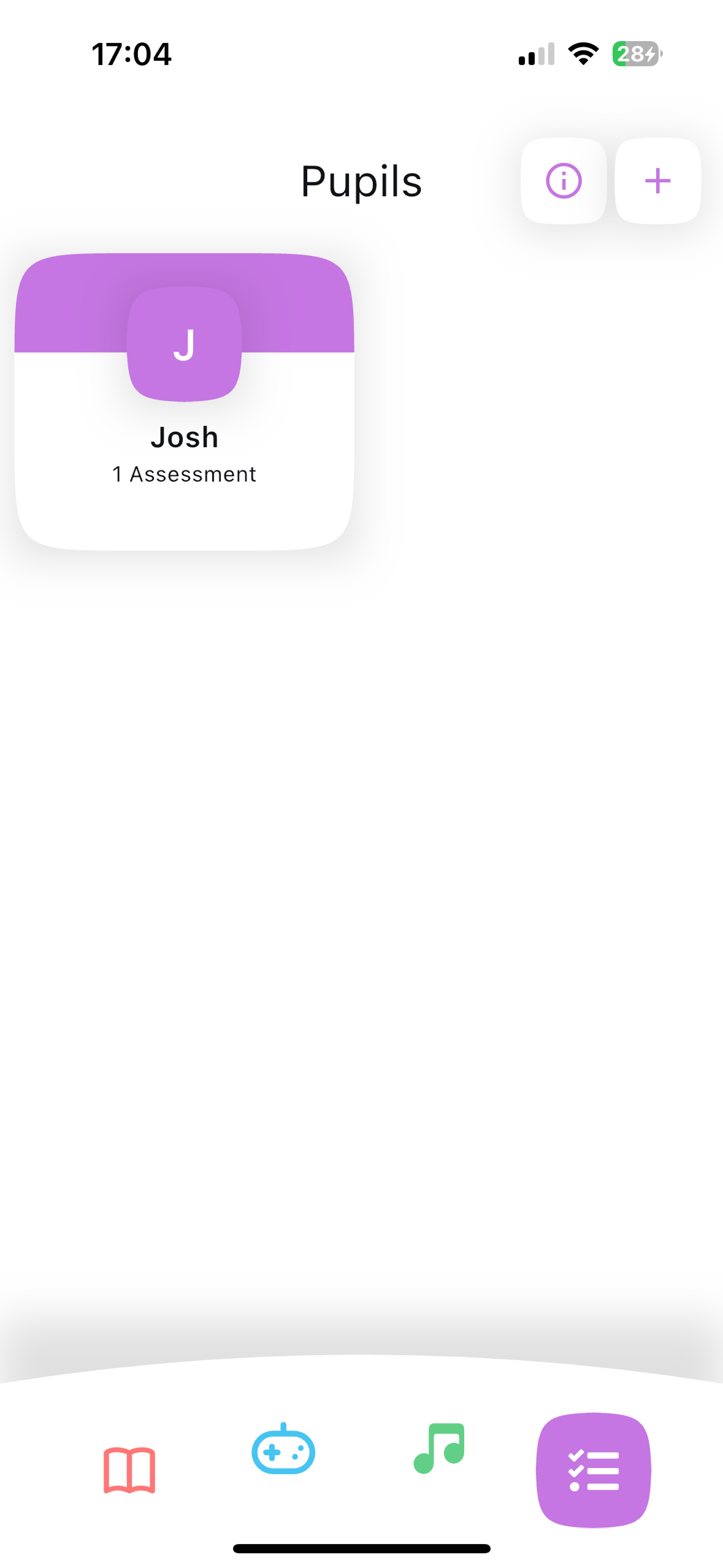
The app hadn't been updated in over a decade: design patterns were obsolete
Text dominated an interface designed for children who are still learning to read
Muted colours, sparse imagery, no sense of play or reward
Navigation flow through a lesson wasn't intuitive enough for young children
Workshops with the company owner, listening to his vision while questioning priorities and constraints
Complex research on apps like Duolingo as a key reference for engagement patterns
Workshops with a Senior UX Designer, debating features and colour direction together
Ongoing collaboration with the dev team, consulting feasibility before committing to solutions
maximally rounded, soft forms throughout. Research shows curved shapes are perceived as friendlier. In children this tendency is especially strong. Not an aesthetic choice: a UX decision.
children at this age process the world primarily through colour and imagery, not text. Iconography and colour always take centre stage.
the app serves three user groups: child, parent, teacher. Each has different needs. The architecture balances all three without overwhelming any.
Visual hierarchy now leads with imagery and colour, matching how children at this age actually process information
Lesson navigation simplified: fewer steps and clearer signposting for young learners
Architecture that genuinely serves three audiences (children, parents, teachers) without overwhelming any one of them

A business card scanner that hides complex OCR behind an effortless scan, review and save flow, designed for a broad B2B audience.
Case study · 2023–2024 · Mobile
Utopia Software. A business card scanner built on OCR.
Users: professionals who leave every meeting with another stack of cards.
The job: scan a card, keep the contact, never lose it again.
My role: the full UI, for people of very different ages and technical confidence.
OCR technology is powerful but invisible: users don't see how it works, they only feel whether it does
Making a technically complex process feel effortless: point, scan, done
Contact management and navigation had to feel natural across a wide age range
every screen had one clear purpose. No unnecessary decisions, no dead ends at any step of the core flow: scan, review, save
the scanning moment had to communicate confidence. Users needed to feel the scan worked before committing to save
close work with developers to ensure design accounted for the real behaviour of the OCR engine. Technical constraints shaped design decisions
Learned that mobile OCR is mostly feedback design: every uncertain moment (focus, parsing, save) needs its own visible confirmation before trust breaks
Designing for an invisible technology built my ability to communicate trust through interface alone
Strengthened ability to communicate design decisions clearly to both technical and business stakeholders

A concept app for discovering live music events and festivals, built around a bold, high-energy neon interface.

A concept wellness app for tracking workouts and daily activity, wrapped in a calm, encouraging interface.

A concept web platform for exploring and learning about art: long-reads, videos, quizzes and a community, wrapped in a warm, gallery-dark interface.
Redesigned the Jolly Phonics app (9M+ downloads) from wireframes to high-fidelity UI, applying child-development psychology and supporting QA with UX and app-flow reviews.
Designed a B2B business-card scanning app built on OCR end to end: from first wireframes to developer handoff, covering the scanning, contact management and navigation flows. Also supported the company's visual identity across digital products and marketing assets.
Brand, logo and graphic design projects, running alongside and after my product roles.

Good design is mostly knowing what to leave out.
I am a UX/UI designer based in Kraków who focuses on the interface itself: its structure, its rhythm, and the choices that quietly make it work for the person on the other side. A master's in Applied Psychology sharpens that read, but stays in the background of the craft.
I care about clarity, hierarchy, and intention. Every spacing decision, every label, every transition has to earn its place. The best products feel inevitable, like they couldn't have been designed any other way. That's the bar I aim for, project after project.
Crafting interfaces that are both beautiful and functional. Consistent design systems that scale.
Turning ambiguous problems into clear, structured interfaces. From early discovery to polished interactions. Always designing for real people.
Working closely with developers, testers and business stakeholders. Translating design decisions into clear handoffs that actually get built right.
I'm a UX/UI designer from Kraków, and a graduate of Applied Psychology at Jagiellonian University. That combination is no coincidence. Understanding how people think, decide and feel shapes every interface decision I make.


